Every now and then a client asks for something that sounds simple and turns into a mini physics experiment. This time, it was a custom Shopify section from my long term client Charles.
The Brief
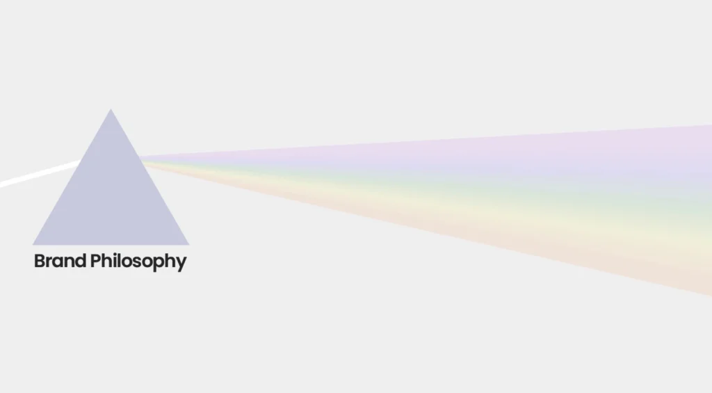
Charles wanted an eye-catching section that highlighted his brand’s unique Trinitas BotanicaTM Methodus philosophy.
He had two major requirements:
- Some text has to wrap around a prism and the text can vary in length.
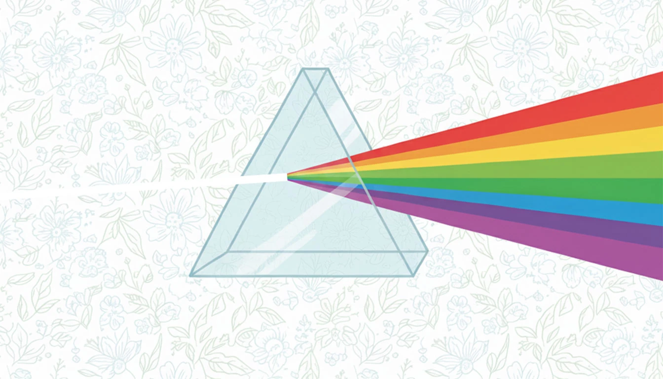
- A light ray enters the prism from the left and emerges as a rainbow on the right.
My Process
I always try to strike a good balance of performance, extensibility, and maintainability when working on a client project. This requires careful planning before I start writing the actual code.
Creating the Incoming Ray and the Rainbow
In this case, my first instinct was to use Canvas or WebGL to animate the rainbow with JavaScript. But after a bit of thought, I realized I could pull off the same effect more cleanly with just some clever CSS.
I created two div elements: one for the incoming ray and one for the emergent rainbow.
The incoming ray was simple enough as it was just a thin white rectangle. However, getting its rotation and alignment right took some trial and error.
For the rainbow, I used a linear gradient background to simulate the colors of refracted light. Then I shaped it so that it’s narrow at one end and wider at the other using a mix of perspective and rotateY. That gave it the illusion of spreading light. This adjustment was very tricky to get right and required plenty of fine-tuning.
Finally, I added subtle rotation animations with rotateZ and @keyframes to make both rays oscillate slightly. Synchronizing both animations was simply a matter of adjusting the animation values so that the rays always move in opposite directions. Once that clicked, the whole thing came alive. A tiny prism made of pure CSS!
Making the Text Flow Around the Prism
The prism itself was an image that Charles provided. My job was to make the text flow around it instead of just filling up a flat, rectangular block.
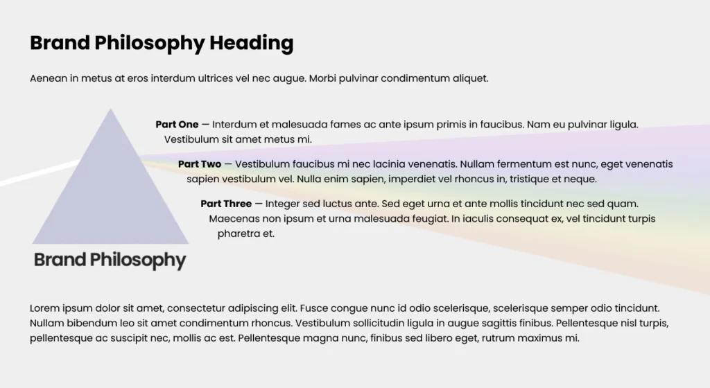
I wrapped the entire prism visual in a container element and used the CSS shape-outside property to match the slope of the prism. This made the text curve naturally around its edges, giving the layout a more organic flow.
The incoming and outgoing rays were only meant to animate behind the text, not push it out of place, so I positioned them carefully using absolute positioning.
Since shape-outside requires the element to float, the wrapper naturally jumped out of the document flow, which collapsed the parent element that had the text and the prism visual container. Instead of over-engineering it, I simply cleared the next sibling. Quick, clean, and reliable.
Giving Charles Full Control
Charles wanted this section on all pages of his website. That meant I needed a setup where he could update the text in one central place and have it propagate everywhere automatically.
I tackled this by leveraging Shopify’s theme settings. The section pulls default text from the theme’s central configuration, so any updates there automatically reflect across the site.
At the same time, I wanted Charles to have the option to override the content on individual pages. I added per-page overrides in the section settings, allowing custom changes without breaking the global defaults.
I also gave him the flexibility to add up to three additional points on any individual page, in addition to Essentia, Viriditas, and Allevatio, if he chooses.