
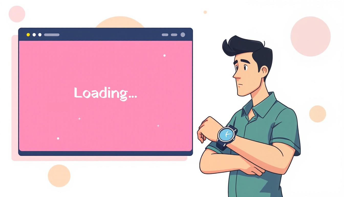
Let’s be real. Nothing kills user experience faster than a website that drags its feet. And the biggest culprit? Images. Huge, unoptimized images. We all love big visuals, but your users don’t love waiting for them to load.
Why Optimized Images Should be a Priority
Images usually make up the bulk of a page’s weight, and when they’re not optimized, every visitor ends up paying the price in seconds (and frustration). Here’s why optimizing them matters more than you think:
- Faster Page Load – Smaller images mean fewer bytes to transfer. Fewer bytes mean faster pages. This might not matter much on high speed home WiFi networks but it absolutely does for mobiles.
- Better SEO – Speed is an actual ranking factor, so bloated images are basically SEO self-sabotage. If your pages take forever to load, your rankings take a hit.
- Reduced Bandwidth – Optimized images save bandwidth for your users. This is important because mobile data can be very expensive in some parts of the world. Also, the extra bandwidth you save adds up to a big total when you are serving thousands or millions of users. This can mean lower hosting bills for you.
- Improved UX – Nobody likes staring at a half-loaded page. Users drop off fast when a site feels slow or janky. Faster loads mean smoother scrolling, happier users, and fewer “I’ll check it later” exits.
The Two Things that I did to Optimize Image Delivery
Other factors being equal, the two things that matter the most for optimized image delivery are choosing the right format, and the right size.
Serve the Right Format
Choosing the right format is the first step to delivering optimized images. The wrong format can bloat your images, slow down your site, and frustrate users without improving image quality, even if the dimensions are perfect.
Here’s the quick breakdown:
- JPEG – Great for photos. Small file sizes, decent quality. Doesn’t support transparency.
- PNG – Perfect for images that need transparency or sharp edges. Photos and screenshots usually have larger file sizes than JPEGs, but flat vector illustrations with limited colors and no gradients can end up smaller if optimized. If you can use
- WebP – The modern all-rounder. Almost always smaller files than JPEG or PNG, supports transparency, and is widely supported.
In practice, WebP is excellent for most use cases. One limitation is that some image editors and software still don’t support it as widely as JPEG or PNG but that’s changing fast.
Let’s take the featured image of this post as an example. The original unoptimized JPEG was 263 KB, while an optimized JPEG came down to 87 KB with no noticeable loss in quality. The unoptimized PNG was 541 KB, and the optimized PNG dropped to 111 KB. The WebP version? Just 41 KB.
Switching from the original JPEG to WebP alone saved over 222 KB for a single image. Multiply that by 10 images in a blog post, and you’re looking at roughly 2.2 MB savings just from using the right format.
Serve the Right Size

Serving a 3840px-wide image to a mobile visitor with a 480px-wide screen is a colossal waste of bandwidth. If the height scales proportionally, that’s a 64× increase in pixel count, and the file size will be much larger as well.
Ideally, visitors should only load images roughly the size they’ll see. For example, if an image renders at 480px wide, that’s the size you should serve. You don’t need a perfect match. Just strike a balance between the required effort and the optimization benefits.
On my site, I use up to eight different image sizes, but in some cases, just two sizes are enough. The key is to serve what’s necessary without over-engineering.
You can easily handle different screen sizes by using the <picture> tag or the srcset attribute on <img> tags, allowing browsers to pick the most appropriate resolution automatically.
It’s important to note that even on large screens, smaller images can be more appropriate depending on the layout. For instance, my archive page cards display smaller featured images when the layout shifts to multiple columns with a sidebar on large screens.
A careful developer keeps this in mind when setting up <picture> and <img> tags. Here’s an example from my own site:
<picture>
	<source srcset="https://hellonitish.com/blog/wp-content/uploads/2025/10/image-optimization-case-study-320x183.webp" media="(max-width: 360px)">
	<source srcset="https://hellonitish.com/blog/wp-content/uploads/2025/10/image-optimization-case-study-460x263.webp" media="(max-width: 520px)">
	<source srcset="https://hellonitish.com/blog/wp-content/uploads/2025/10/image-optimization-case-study-640x366.webp" media="(max-width: 720px)">
	<source srcset="https://hellonitish.com/blog/wp-content/uploads/2025/10/image-optimization-case-study-800x457.webp" media="(max-width: 767px)">
	<source srcset="https://hellonitish.com/blog/wp-content/uploads/2025/10/image-optimization-case-study-640x366.webp" media="(max-width: 991px)">
	<img class="n-image-responsive n-round-x5" src="https://hellonitish.com/blog/wp-content/uploads/2025/10/image-optimization-case-study-460x263.webp" alt="">
</picture>
In the previous section, I mentioned the full-size WebP image is around 41 KB.
But on my site, I only need to serve a 460px version on larger screens because of how the theme is designed. That smaller image weighs just 8KB saving about 32KB per image. With 10 posts on an archive page, that’s roughly 320KB saved per page load. On a slow network, that difference can be huge.
And when a million people visit similar pages, that 320KB saved per page adds up to roughly 300GB of saved bandwidth, translating into substantial cost savings.
For eCommerce stores, the impact is even greater. Imagine 50+ product images loading as users scroll through a catalog. Every saved kilobyte means faster pages, higher conversions and reduced costs.
How Shopify and WordPress Handle Image Optimization
Shopify and WordPress both let you serve optimized images, but they approach it differently.
Shopify does most of the work automatically. Uploaded images are converted to WebP for supported browsers, and multiple sizes are generated in roughly 100px increments. The browser picks the version closest to the visitor’s screen based on the srcset value. A developer still needs to pair this with appropriate sizes value to get maximum benefit. You can deliver more targeted and optimized images using the picture tag but that requires a developer (like me).
WordPress, on the other hand, gives you more control but also more responsibility. By default, it generates a few standard image sizes (thumbnail, medium, large), but to get more precise optimization, you often need plugins like Smush, ShortPixel, or WebP Express. These tools handle format conversion, resizing, and compression, but you have to install and configure them yourself.
In short: Shopify is automatic and hassle-free, while WordPress is flexible but requires setup. Both can deliver fast images — it’s just a question of how much manual work you want to do.
I also take optimization a step further by running custom scripts to convert images to WebP, fine-tune compression, and create extra size variants when needed to make sure your site loads fast without sacrificing quality.
How Much Difference Can it Make?
That depends on how unoptimized your current setup is.
No Image Optimization at All
A typical archive page on my site shows 10 post cards, each with its own featured image. Serving full-size, unoptimized JPEGs adds up to around 2,630 KB of image weight. Properly sized and optimized WebP versions of the same images total just 80 KB which is about 97% less image weight for the page.
Some Optimizations Already in Place
If your images are already properly resized, switching to WebP can still cut file sizes by up to 50%.
If you’re already using WebP but not resizing correctly, the savings depend on how large the downloaded image is compared to its displayed size.
Tips to Further Optimize Image Delivery
Optimizing size and format gets you most of the way there, but there are a few extra tricks that can squeeze out even more speed. The idea is simple: load what matters first, and delay everything else.
Prioritize Above-the-Fold Images
These are the images users see immediately when a page loads. For instance, your hero banners, logos, or key visuals. Because they appear first, the browser should treat them as high priority. Use fetch-priority="high" so the browser knows to load them immediately. This ensures your site feels fast right from the start.
Lazy Load Other Images
Images further down the page, in carousels, or below-the-fold sections don’t need to load immediately. Lazy-load these images using loading="lazy". This cuts initial page weight, reduces bandwidth, and improves perceived speed.
There are some caveats though. For example, carousels are a bit tricky. If you lazy-load carousel images, they often only start loading when the slide actually comes into view. This can cause a noticeable delay because the image might “pop in” a second after the slide appears.
Lazy loading takes some effort and expertise to get right. This is where I can help you get maximum performance without impacting user experience.
Final Thoughts
Get size and format right, prioritize above-the-fold images, lazy-load the rest and your site will feel noticeably faster for everyone. You can always hire me if you want to outsource all this to someone competent.